Better Data Reporting Practices - Gridless, Grouping, Layout Direction
One of the most overlooked elements of reporting is data presentation. It is an afterthought compared to core reporting elements like data compilation and analysis largely due to its focus on aesthetics rather than computation. This focus may seem irrelevant to the general purpose of a report, which is to communicate compiled information, but if it is forgotten, then the door is left open to a communication breakdown. If this happens, then it is very likely that misinformed business decisions wi
Excerpt
One of the most overlooked elements of reporting is data presentation. It is an afterthought compared to core reporting elements like data compilation and analysis largely due to its focus on aesthetics rather than computation. This focus may seem irrelevant to the general purpose of a report, which is to communicate compiled information, but if it is forgotten, then the door is left open to a communication breakdown. If this happens, then it is very likely that misinformed business decisions will happen, voiding the report and potentially hurting a business. In order to prevent this from happening, everything from sheet formatting to linking to data sources should be considered to communicate the reports intended message and guide viewers through its contents in a seamless manner. In the remainder of this blog, I will provide three tips on how you can improve your data presentation and prevent the data ambiguity explained above from happening.
Go Gridless with Whitespace
Whenever I start a new report, the first thing I do is remove all of the gridlines. By taking this action when I start to build, I remove the visual distractions caused by grey grid lines and create a blank canvas to work with. From this blank canvas, I like to section off gridded tables containing similar data points in order to control the message that I am trying communicate. These tables are separated by at least one blank row and column, creating a pattern that allows consumers of your report to be able to quickly navigate through the report and gather the information that they were looking for without dealing with the noise that is presented by hundreds of grey gridlines in a sea of unused cells.

**Note:** Excel is built on a grid system and clearly highlights the current selected cell with a blue box. This means that going gridless should never cause any confusion as to where the cursor is within the sheet.
The three ways to remove the gridlines from your excel sheet are:
- Navigate to the “Layout” section of the navigation ribbon and unselect the “Gridlines” check box under “View”

- Select “Excel” > “Preferences” and click on the “View” tab. Within the “View” tab, under “Window Options”, unselect “Show gridlines”

- Select all of the cells in the sheet and use the “Fill color” option to fill in all of the cells with white

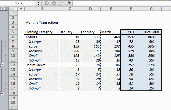
Group Common Data Points
As you get into a rhythm of pulling and analyzing the same data points week in and week out, the natural progression in your reporting will be to layer in more related data points. In a retail business, this natural progression might be going from a high level look at transactions and average order value into the distribution of those metrics among product categories like shirts, pants, accessories or sizes like large, medium and small. In a SaaS business, a report that looks at how each portion of a sales funnel would most likely start to layer in acquisition channel data or even methods that were used to acquire a lead.
As you can see from the two examples above, this progression can happen in many ways, regardless of your business metrics, and tend to scale quickly. When this happens, reports become richer, helping your business with more actionable insights, but at the same time makes reports larger and more complex.
To combat the difficulties of scaling a report, a great excel feature that should be used to keep your report in order is “Grouping”. This feature allows users to group similar data together in a format that users can then show and hide as they navigate through the sheet.
To group your common data points together, highlight the section of rows or columns that contain common data points and under “Data” in the navigation ribbon, click “Group”
Once there is at least one grouping present in the sheet, a grey navigation element appears on the left hand side or top of the sheet, which will allow you to show or hide your grouped data.
Choose the Best Direction to Lay Out Your Data
This is a rule that should be followed before you build out any report involving time-series information in order to future proof your reporting template.
The reason why you should consider the direction of your data input before you start is because time-based reports can drastically change depending on whether the time series is small (Quarterly, Monthly) or large (Weekly, Daily). Based on this knowledge, you should plan accordingly and understand how data will expand over time.
If you are using a daily or weekly time series, then you shouldn’t insert data horizontally (columns) for each new date, because as time goes on, your data will become difficult to compare and comprehend as data points become hidden from view. If data is being reporting on a quarterly or monthly basis, then you should have freedom to expand data horizontally or vertically as these time series contain small enough data that additional rows or columns will have minimal or no effect on the overall presentation. In this case, the decision on how the data will be laid out is left up to analyst, but it is important to stick to the goal of keeping as much data visible in the sheet as possible to make it easier to consume and less likely for consumers to miss data points by not navigating far enough into the spreadsheet.


Small Adjustments, Big Wins
After reading through each of my tips you should now be able make simple improvements to your reports that will make leaps and bounds with your data presentation. None of these methods involve complex excel features and all require little manual effort put in place. I hope you have found these tips useful and be on the look out for more posts like this in the future!